-Workbench/ Desk Area
-Desk Lamp
-Tools
-A Magic Set including: Deck of Cards, Handkerchiefs, Cup and Balls
-Hard Book Cover
-Glue
-String
-Ruler
Some of these props, such as the glue, string and ruler, were much easier to choose upon due to us knowing the effect we wanted to create and their aesthetic not having too big an impact on the overall aesthetic of the clip.-String
-Ruler
Workbench/ Desk Area
The workbench/ desk area is important as it is the most prominent aspect of the set for the villain half of the opening. Due to this, we needed to make sure that we selected a workspace which reflected the dark tone of the film.
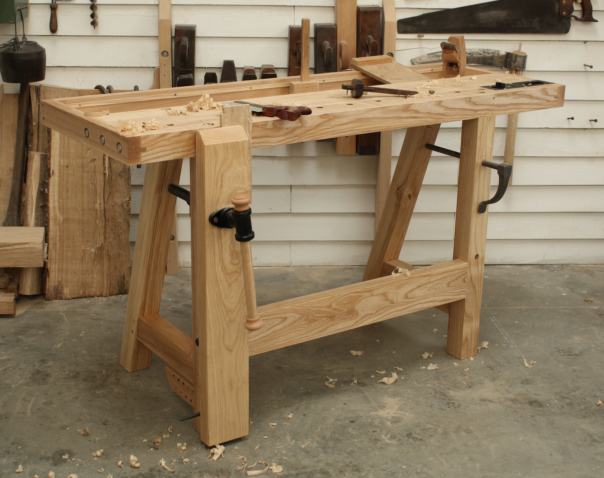
This workbench looks too much like something you would find in a carpentry workshop, rather than a villain's den. In addition, Due to this, we decided to look for something more like a desk.

This desk area looks too professional for it's purpose as a villain's den and therefore we decided to start looking at something that seemed more practical.

Desk Lamp
The lamp we use will have an impact on the aesthetic of the set as it will help portray a sense of how wealthy the character is as well as affecting the lighting of the villain's aspects of the clip.

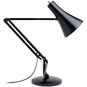
We then looked at a more complex design to see whether this would be more effective as it would give us more control in positioning of the light. However, we decided that this would make the villain look too professional and logical.
Tools

Magic Sets
The magic set is the fundamental prop for our film opening. Without it, it will not be possible to present our protagonist as a magician. Due to this, we need to find a magic set which does not appear childlike and comes across to the audience as realistic material for a simple street magician.

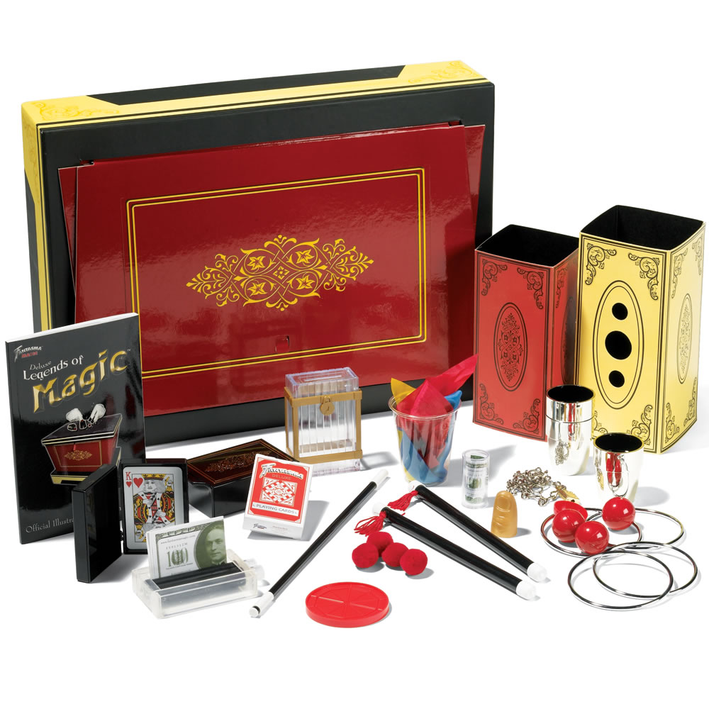
The second magic set we looked at appeared extremely professional and would therefore suit the aesthetic of the film. However, this magic set was a lot more expensive and was way out of our budget.
Due to this, we aim to get a magic set which appears more like the second magic set yet is still within our budget.
Book Cover
The book cover we use is important as it must appear completely normal and must not look spectacular in any way. This is because it is supposed to look hand made and cannot therefore look eccentric or special.


We first looked at this purple book cover as the design on the front was enticing and therefore would fit with the narrative of Azier finding it in a charity shop. However, it looks too eccentric and regal for it's use therefore we decided to look at something a bit more subtle.
We next looked at this dark red book cover as the design on the front was a lot simpler than that of the purple book and the red could have been to signify the danger of the book. However, it still appears too obvious in comparison to most books and would be the obvious book of choice amongst others, defeating the point of the book being concealed for so long.

Finally, we looked at this much more worn book cover. It was this cover that most fitted our ideals, however the brown colouring of the cover made it appear slightly too generic and therefore we have decided to look for a book very similar to this, with a worn aesthetic. However, we would like the cover to have a touch more colour than this one.
By Olivia Calver
No comments:
Post a Comment